Something New
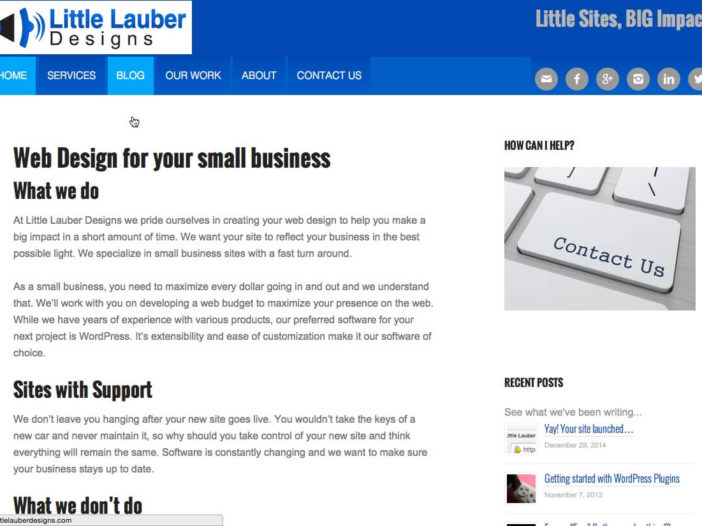
It’s a new year and a new site design for 2015. Even though my site had a decent design, I didn’t think it really reflected myself or the sites I was creating for my clients. My original design came straight from my favorite framework, Genesis by Studiopress. I have access to any of their themes, and on my last design I went with their popular Minimum Pro theme. I found a decent picture to put in the big “space”, but I wasn’t completely thrilled with it.
Most of the pre-built themes from Genesis are pretty complete. While it’s certainly simple to just grab and go in that regard, I feIt when I chose one of those for clients I wasn’t really giving them a truly custom theme, even with their necessary modifications. Don’t get me wrong, their developer pack is a great investment. You can certainly borrow some great ideas from these themes.
My Tools Changed
As my 2014 played out, however, I started to move towards tools like SASS, Grunt, and Varying Vagrant Vagrants. These tools don’t necessarily play well with above mentioned pre-built themes. So, I decided I needed to utilize the Genesis Sample theme with SASS modifications. I found one via GitHub by Matt Banks and decided to fork it. I’ve made my modifications, adding and changing things for my clients needs and switching to the Bourbon.io library to create Genesis with Bourbon theme.
So, when I was thinking about my site’s design, I thought it made sense to utilize the theme I start all my client projects.
What Changed?
So what did I add and change?
- One of the first things I decided was to get rid of the big image in the middle. I never utilized that image the way I originally intended, so I decide to make the content more up front.
- A sticky menu. I’m a big fan menus that are available. With all the scrolling on some blog posts, it’s nice to have a way to quickly go to another page, without having to scroll back up from page or post.
- Updated Portfolio view. I was able to keep the portfolio code from my old theme, but wrote some new CSS for the display. Now, hovering over a portfolio image gives you a preview but shows more on smaller screens.
- A bunch of items that you won’t notice, like compressed CSS and lazy loading Javascript to speed up site load, unless you’re a developer.
It’s Never Finished
A site is never “finished”. Luckily, we don’t put those silly “under construction” animated gifs on sites anymore. So, while I pushed out this new design, I know everything is not complete. When you’re working on your own site, it’s never as easy as doing work for someone else. I still want to add my testimonials, along with making some more graphic changes. For now, I’m happy with how things turned out though and I look forward to hearing what others think of the changes.
Happy New Year!

